Now that I have officially decided to keep my blog built with Next, I thought my blog tinkering time was over and I could just go back to sitting down and writing posts.
But then I realized I can still mess with the design...duh!
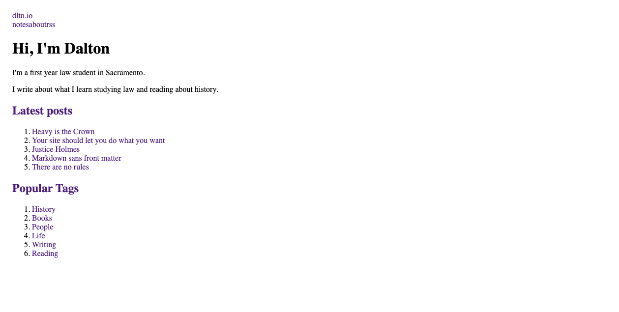
The blog has been pretty much this same design since its inception: white background, black text, using Inter. It’s clean, easy to read, and looks great on any device.
But it is a bit boring. I resonated with what The Jelly Teapot wrote about a site’s visual identity:
When I visit [certain] websites...I don’t need to read a single word, know the URL or the name of the site to know the one I am viewing. Same when I see the entries from Michael Tsai, Kev Quirk, or Quanta Magazine in my newsreader: they stand out in the feed and I know from which blog or website it’s from, as I recognise their icon.
I feel like my blog currently lacks this kind of visual identity. Its current icon — or rather its lack of an icon — feels a little like other feeds I am subscribed to, coming from Mastodon or Medium which all share the same favicon: generic, anonymous, and doesn’t stand out visually from the others.
Like I wrote in a previous post, There is no place like home: Why I love my blog, I know what makes my blog mine, what its identity is: bare-bones design, minimal style, tiny footprint, etc. But for the casual reader, for someone stumbling upon one of my posts, it can definitely feel a bit plain, boring, forgettable.
Might feels plain, boring, and forgettable. Like Magand’s though, that’s sort of the point? I like how easy everything is to read. But, still, I think I’m ready for something new.
I’ve tried using serif fonts in the past because since I write about history and books a lot, I wanted my site to feel more serious and studious. Crimson is an amazing typeface for that vibe. But the result was almost too serious and studios; when I read shorter posts from the archive, it just felt out of place.
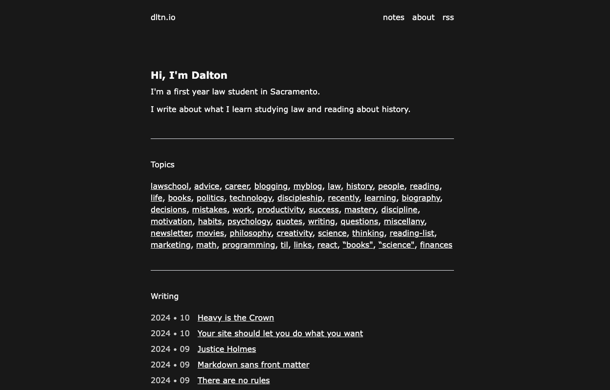
Here are some renditions I’ve been working on.
Here’s a futuristic space vibe, inspired by Luke Harris’s site. I love the colors and the typeface, but my wife and I both agree that it doesn’t fit the overall content of my site very much. I do like it, a lot though.
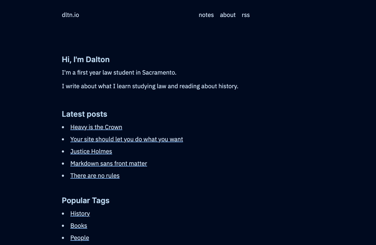
And light mode
I think I’m going to remove the entire list of tags and posts from the /index because there are just too many things to click on. I’ll just build out a separate /tags page. So I think I’ll stick with this layout, I just don’t know which vibe to go with.
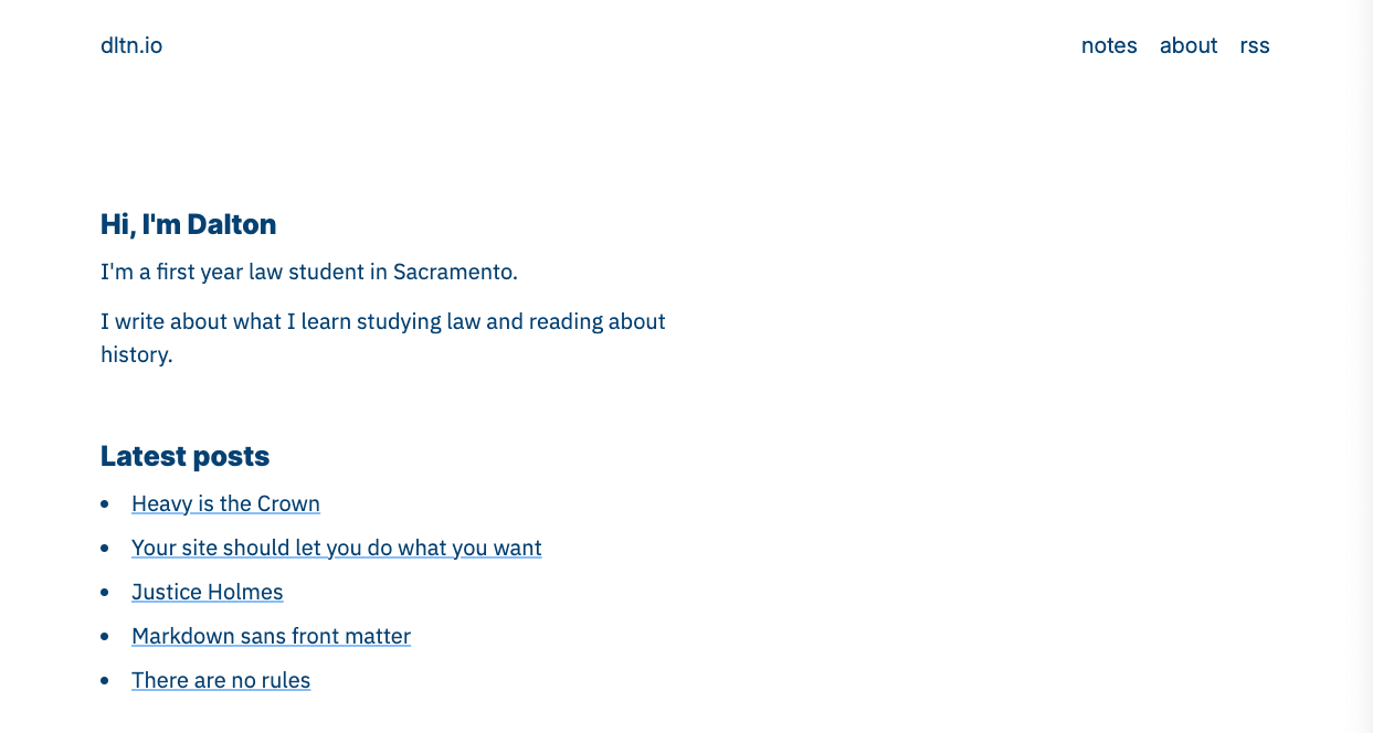
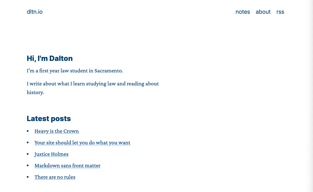
Here are some serif options.
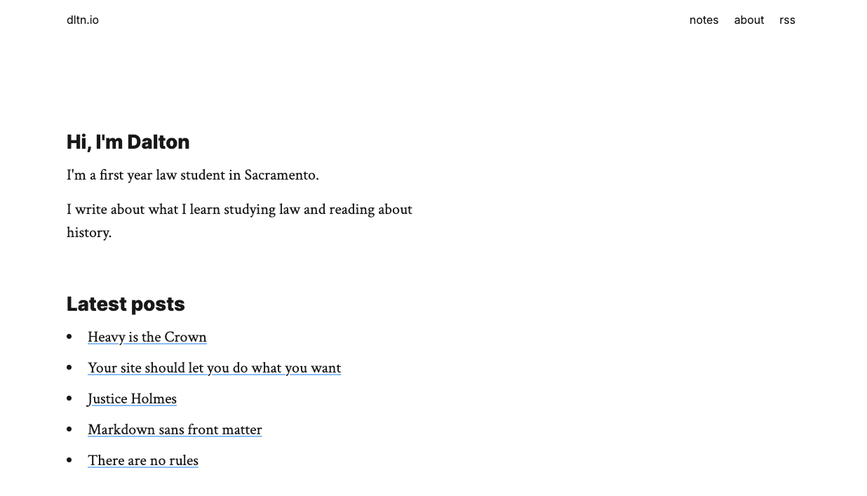
And, of course I had to see what the genius-professor-too-busy-to-write-CSS was like. (I actually really love it.)
I also tried a pure black background with Verdana. My reasoning with trying Verdana was that it’s so classic and timeless that it looks studios and serious, but it’s not too serious to be out of place on a personal blog.
Still, every time I’ve tried a new color scheme or layout in the past, I always end up liking it less than what I currently have. I don’t know if that’s because what I have is familiar, or what I have actually just works really well. (Either way, thanks, Steph for the inspiration.)
For now the designs will sit in limbo in a GitHub branch, maybe never seeing the light of day.
Tagged